We start our evaluation with a descriptive analysis of our trial data. The data we will be working with for the remainder of this tutorial can be downloaded here, or from the tutorial’s Github repository. We refer readers who have skipped the first part of the tutorial to Chapter 1, where we covered how to correctly set up one’s R environment and import the data used in the following analyses.
First, let us familiarize ourselves with the data. Our dataset is based on a “real-world” RCT which evaluated the effectiveness of an Internet-based treatment for subthreshold depression to a waitlist control condition (Ebert et al. 2018). Notably, the data set provided here does not consist of the original individual patient data collected in the trial; we have simulated a “clone” of this trial that shares most of its statistical properties but does not contain any actual patient data. The simulation code is provided in the Github repository (see here).
Our primary outcome in this trial evaluation will be patients’ depressive symptom severity at post-test (7 weeks after randomization), as measured by the Center for Epidemiological Studies’ Depression Scale or CES-D(Radloff 1977). The scores obtained by this instrument can take values from 0 to 60, with higher values indicating higher depressive symptom severity. The CES-D was also used to measure depressive symptoms severity at baseline and at a 3-month follow-up. This means that our data set contains three variables: cesd.0, cesd.1 and cesd.2, which store the CES-D values at baseline, post-test and 3-month follow-up, respectively. The other recorded variables are:
Behavioral activation (badssf), as measured by the Behavioral Activation for Depression Scale, BADS-SF (Manos, Kanter, and Luo 2011). This outcome was measured at baseline, post-test, and 3-month follow-up.
Anxiety (hadsa), as measured by the anxiety subscale of the Hospital Anxiety and Depression Scale, HADS-A (Zigmond and Snaith 1983). This outcome was measured at baseline, post-test, and 3-month follow-up.
Age (age), measured in years.
Sex (sex), which is coded as 0 = male, 1 = female.
Previous psychotherapy experience (prevpsychoth), which can be 1 (yes) or 0 (no).
Previous health training experience (prevtraining), which can be 1 (yes) or 0 (no).
Children (child), which can be 1 (yes) or 0 (no).
Employment (employ), which can be 1 (yes) or 0 (no).
Relationship (rel), which can be 0 (single), 1 (married/in a relationship), 2 (divorced/separated), or 3 (widowed).
Education (degree), which is encoded as 0 (no formal education completed), 1 (education up to high school only; 7-9 years), 2 (high school education; 12-13 years), 3 (education after highschool), 4 (post-graduate education; > 17 years), 5 (Other).
Attitudes toward seeking professional help (atsphs.0), as measured by the ATSPPH-SF (Picco et al. 2016), whereby higher value indicate a higher willingness to seek professional psychological help.
Credibility and expectancy (ceq), as measured by the Credibility/Expectancy Questionnnaire(Devilly and Borkovec 2000).
Trial condition (group), where 1 indicates the treatment group (Internet-based intervention for subthreshold depression), and 0 the control group (waitlist).
An excellent method to get an overview of all variables included in a data frame is to use the skim function included in the skimr package (Waring et al. 2022). Once this package has been installed on our computer, we can run the following code:
There is a lot to unpack here, so let us go through the output (which we simplified a little here) step by step. First, we presented with a summary of our data set: we have 546 rows, corresponding to the \(N\)=546 patients included in our trial. We also see that we have 21 variables in our data, details of which are provided below. The skim function splits the displayed summary statistics by class; the first section shows columns encoded as character variables, and the second section shows the numeric columns.
This is also a good way to check if imported variables have indeed the desired class, which is not the case in our example: the only “real” character variable in our data set is id; all other columns are actually numeric (although one could also encode them as factors). Thus, let us convert those variables first, which can be done using the as.numeric function:
To further eyeball the data, it is also helpful to run the skim function separately for the intervention and control group. We can achieve this by using the filter function within a pipe:
data %>%filter(group ==0) %>%skim() # Control groupdata %>%filter(group ==1) %>%skim() # Intervention group
Splitting up the results by group is particularly helpful to see differences in the primary outcome. For now, let us focus on the values of cesd.1 and cesd.2, which measure the depressive symptom severity at post-test and 3-month follow-up, respectively:
The upper rows show the output for the control group and the lower ones for the intervention group. First, we see that, depending on the group and outcome, data are available for 69.2-72.2% of all patients. That means that roughly one-third of all data at post-test and follow-up is missing, which is considerable. We see that the complete_rate is somewhat higher at post-test and approximately similar in both groups. More importantly, we see that, at both assessment points, the mean CES-D value in the intervention group is lower than in the control group. This is a preliminary sign that the intervention could have had an effect on the recruited sample, but of course, a more rigorous test is required to confirm this.
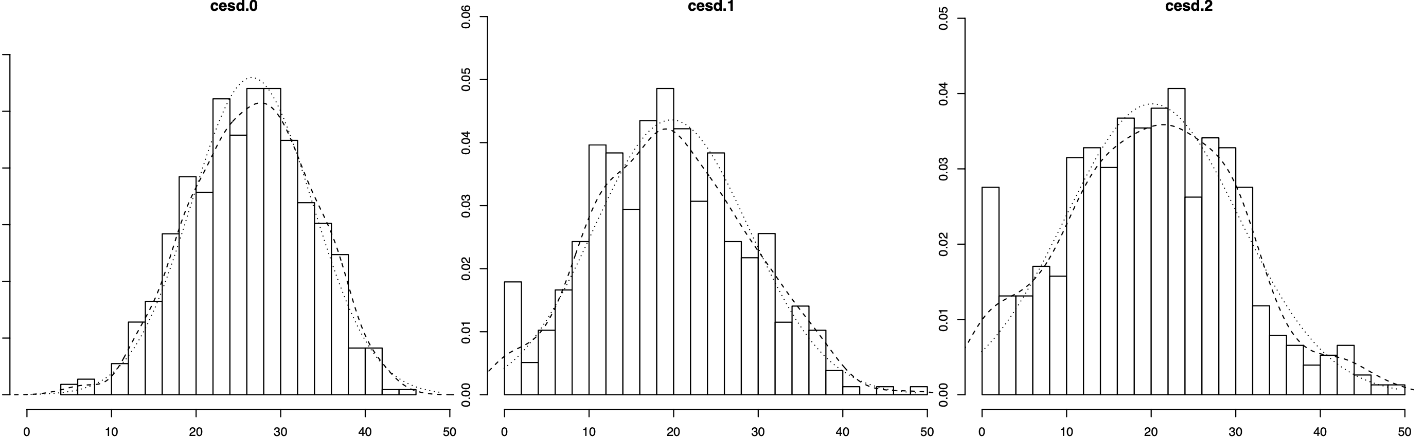
It is also helpful to have a look at the distribution of our primary outcome at baseline, post-test and 3-month follow-up. To create a histogram of all three variables, we can use the multi.hist function included in the psych package (Revelle 2022):
There are a few interesting things to see here. First, compared to baseline, the CES-D scores at post-test and follow-up are shifted slightly to the left. This could be caused by an inherent effect of the intervention in the treatment group; but other causes such as regression to the mean or spontaneous remission could also play a role. We also see that, while all three histograms roughly follow a bell curve, the post-test and follow-up values seem to be more dispersed, with more values on the lower end of the scale, but also some very high scores on the other end.
The last step in our descriptive analysis is to quantify to amount of missing data at all assessment points. This part is crucial since loss-to-follow-up is also a mandatory part of the Consolidated Standards of Reporting Trials (CONSORT, Moher et al. 2012) flow chart, which we will be creating later.
To create an overview of the missing outcome data, we focus on our primary outcome, the cesd variables. To count the missings, we can use the very helpful is.na function. This function checks if elements in a vector are missing (NA). It returns TRUE if that is the case, and FALSE otherwise. We can then apply the sum function to this result to count the number of missings in a vector. Here is a small example:
x <-c(1, 2, 3, 4, 5, NA, NA, 200) # Create vectorsum(is.na(x)) # Count the number of missings
Show result
## [1] 2
We will now put this function into practice and extract the number of missings in the cesd variables at all three assessment points. To simplify this, we use the with function, which tells R that all code written within the function should be run with our data set data. This means that we do not have to extract each variable from data using the $ operator. We save the result as na.all. Then, we divide the results by the number of rows in data to get the amount of missing data in percent, and save this result as na.all.p.
We are not only interested in the overall dropout but also in the individual missingness in each randomized group. Therefore, let us repeat the procedure from before for the intervention and control group specifically.
We can now use this information to populate the study flow chart. Such flow charts are mandated by the CONSORT reporting guidelines that most biomedical journals have endorsed, and which should be seen as a standard part of every RCT analysis report. It is possible to generate CONSORT flow charts directly in R using the consort package (Dayim 2023). However, especially for beginners, it may be more convenient to simply download the official PDF or MS Word template from the CONSORT website, and then populate it with the numbers that we just calculated.
In the graphic on the next page, we have used the missingness data we calculated above to indicate the number of participants providing data, as well as the number of participants being lost to follow-up at each assessment point. Please note that the CONSORT flow chart also contains information on the screening process (how many individuals were screened, how many were excluded from the trial, and for what reason?). This information is not included in the final RCT data set and is something that must be recorded while the trial is running.
Exemplary CONSORT flow chart for our trial.
The CONSORT Statement
The CONSORT Statement has been first introduced in 1996 to improve the reporting of randomized clinical trials in health research. Its goal is to provide a set of standards that all RCT reports should adhere to. The CONSORT guidelines are supported by almost all relevant journals in the mental health field, so adhering to them is highly recommended.
The latest 2010 version of the CONSORT statement consists of a main paper (Schulz, Altman, and Moher 2010) and an elaboration and explanation article (Moher et al. 2012), both of which are extremely helpful resources for novice RCT analysts. The core parts of the CONSORT Statement are the trial flow chart, which we now learned how to create, and the 25-item CONSORT Checklist, which should be filled out and provided with every RCT report, and which can be downloaded here.
Devilly, Grant J, and Thomas D Borkovec. 2000. “Psychometric Properties of the Credibility/Expectancy Questionnaire.”Journal of Behavior Therapy and Experimental Psychiatry 31 (2): 73–86. https://doi.org/10.1016/s0005-7916(00)00012-4.
Ebert, David Daniel, Claudia Buntrock, Dirk Lehr, Filip Smit, Heleen Riper, Harald Baumeister, Pim Cuijpers, and Matthias Berking. 2018. “Effectiveness of Web-and Mobile-Based Treatment of Subthreshold Depression with Adherence-Focused Guidance: A Single-Blind Randomized Controlled Trial.”Behavior Therapy 49 (1): 71–83. https://doi.org/10.1016/j.beth.2017.05.004.
Manos, Rachel C, Jonathan W Kanter, and Wen Luo. 2011. “The Behavioral Activation for Depression Scale–Short Form: Development and Validation.”Behavior Therapy 42 (4): 726–39. https://doi.org/10.1016/j.beth.2011.04.004.
Moher, David, Sally Hopewell, Kenneth F Schulz, Victor Montori, Peter C Gøtzsche, Philip J Devereaux, Diana Elbourne, Matthias Egger, and Douglas G Altman. 2012. “CONSORT 2010 Explanation and Elaboration: Updated Guidelines for Reporting Parallel Group Randomised Trials.”International Journal of Surgery 10 (1): 28–55. https://doi.org/10.1016/j.ijsu.2011.10.001.
Picco, Louisa, Edimanysah Abdin, Siow Ann Chong, Shirlene Pang, Saleha Shafie, Boon Yiang Chua, Janhavi A Vaingankar, Lue Ping Ong, Jenny Tay, and Mythily Subramaniam. 2016. “Attitudes Toward Seeking Professional Psychological Help: Factor Structure and Socio-Demographic Predictors.”Frontiers in Psychology 7: 547. https://doi.org/10.3389/fpsyg.2016.00547.
Radloff, L. S. 1977. “The CES-D Scale: A Self-Report Depression Scale for Research in the General Population.”Applied Psychological Measurement 1 (3): 385–401. https://doi.org/10.1177/014662167700100306.
Revelle, William. 2022. psych: Procedures for Psychological, Psychometric, and Personality Research. Evanston, Illinois: Northwestern University. https://CRAN.R-project.org/package=psych.
Schulz, Kenneth F, Douglas G Altman, and David Moher. 2010. “CONSORT 2010 Statement: Updated Guidelines for Reporting Parallel Group Randomised Trials.”Journal of Pharmacology and Pharmacotherapeutics 1 (2): 100–107. https://doi.org/10.1186/1741-7015-8-18.
Waring, Elin, Michael Quinn, Amelia McNamara, Eduardo Arino de la Rubia, Hao Zhu, and Shannon Ellis. 2022. skimr: Compact and Flexible Summaries of Data. https://CRAN.R-project.org/package=skimr.